
Chicago Wedding Trends: What Couples Are Choosing in 2027 If you’re planning a 2027 wedding in Chicago, your saved folder might already have a little bit of everything: sweeping fabric, candlelit tables, rich flowers, and a welcome sign that somehow deserves its own photo shoot. The challenge is figuring out which ideas belong together and […]
Chicago Wedding Trends 2027: Colors, Draping & Décor
Chicago Wedding Trends: What Couples Are Choosing in 2027
If you’re planning a 2027 wedding in Chicago, your saved folder might already have a little bit of everything: sweeping fabric, candlelit tables, rich flowers, and a welcome sign that somehow deserves its own photo shoot.
The challenge is figuring out which ideas belong together and which ones actually belong at your wedding.
As a Chicago wedding photographer, I look at these details with the whole day in mind. How will the room feel when your guests walk in? Can everyone comfortably talk across the table? Will you have time to enjoy the space you spent months designing?
The emerging wedding trends for 2027 offer plenty of inspiration, especially if you love texture, expressive color, and personal details. Here are the directions worth exploring, along with my thoughts on bringing them into a Chicago celebration.
Planning note: This is a look ahead, researched in November 2026. National forecasts and early vendor requests suggest where weddings are heading; they don’t mean every Chicago couple is making the same choices.
1. Wedding draping that changes the feeling of a room

Draping deserves a place near the top of your inspiration board. The Knot’s 2027 forecast includes textured fabric within its romantic styling direction, and it’s an idea with plenty of possibilities beyond a ceremony backdrop.
For your wedding, that might mean fabric framing the entrance, a softly draped wall behind the head table, or a canopy that makes a large dining space feel more intimate. Those are different levels of production, so bring your favorite reference images to your planner before deciding how much of the room to transform.
In Chicago, I would start with the architecture. In a brick loft, fabric can soften the hard lines. In an ornate ballroom, a smaller installation might give you the softness you want while allowing the existing details to remain visible.
From a photography perspective, think about what the fabric will frame. Your ceremony, your dinner table, and the entrance guests walk through are all meaningful places to create a focal point.
Ask your design team about installation access, fabric requirements, attachment options, and the complete setup and removal cost. A single beautiful backdrop may be the right choice for your space.
2. Rich wedding colors with room to breathe
Merlot, plum, powder blue, and moss green appear in The Knot’s national color forecast. Locally, Chicago floral studio Life In Bloom describes early 2027 requests that combine soft neutral foundations with deeper earthy tones.
That leaves plenty of room to find a palette that feels like you. You can love color without filling every surface with it.
Here are three combinations I would explore with a designer. These are styling suggestions, rather than ranked trend predictions:
| Palette idea | A way to use it |
|---|---|
| Plum, moss, and ivory | Green linens, plum napkins, and ivory paper goods |
| Powder blue, cream, and silver | Blue accents with pale flowers and reflective tabletop details |
| Merlot, blush, and warm white | Deep floral accents balanced by lighter linens and stationery |
Bring physical samples into your venue when possible. A fabric swatch beside a window can feel very different from the same fabric under evening reception lighting.
My advice is to choose the colors you keep returning to, then let your florist and planner help you decide where each one belongs.
3. Texture that makes simple details feel considered
A wedding doesn’t need an enormous floral installation to have visual interest. The finish of a menu, the folds in a napkin, and the surface of a linen all contribute to the room.
Life In Bloom’s Chicago report identifies texture as an important part of current floral requests. The national forecast also includes antique lace and heritage-inspired styling.
For your own design, consider a small mix of materials: a textured tablecloth, smooth glassware, soft ribbon, and substantial paper. You don’t need every texture on every table.
If you prefer an ivory wedding palette, this is a lovely place to add depth. Ask your rental team to show you a complete sample place setting. Seeing the pieces together makes it much easier to decide whether you love the overall effect.
I also love when a detail has meaning beyond its appearance. A family textile or an heirloom serving piece can become part of the design and part of the story behind your photographs.
4. Silver wedding décor with a collected feel
Silver is one of the clearer search signals in the national forecast. The Knot reports a 133% year-over-year increase in searches across silver flatware, platinum jewelry, and cool-toned décor. That is its reported trend data, rather than a Chicago-specific search measurement.
You could introduce the look through candlesticks, serving trays, picture frames, or flatware. My preference would be to choose pieces that make sense together rather than adding a metallic accent simply because it’s trending.
For a historic Chicago setting, a few antique-looking silver pieces could feel beautifully at home. In a contemporary room, cleaner shapes might suit the surroundings better. These are design interpretations to discuss with your rental team.
You also don’t have to replace every gold detail you already love. Look at the full table before deciding what needs to change.
5. Wedding flowers with movement and thoughtful placement

Cascading flowers are worth watching. Floral company Poppy reports that requests for cascading bouquets rose from 7.9% for its 2025 weddings to 12.1% for its 2027 weddings booked so far. Those figures describe Poppy’s own customers, rather than all weddings.
For reception inspiration, consider how a trailing arrangement could soften the edge of a bar or bring movement to a focal table. Ask your florist which flowers can achieve the shape you love within your season and budget.
Placement matters as much as size. A beautiful arrangement can frame your ceremony, welcome guests, or anchor the room. Before adding more flowers, decide where you most want people to notice them.
For dinner tables, I always encourage thinking about the view from a guest’s seat. Can people see each other? Is there room for their drinks and place settings? A table can photograph beautifully and still feel comfortable to sit at.
If you’re interested in overhead florals, involve the venue early. Life In Bloom specifically notes that suspended designs require venue-specific installation planning.
6. Personal wedding signage and paper details
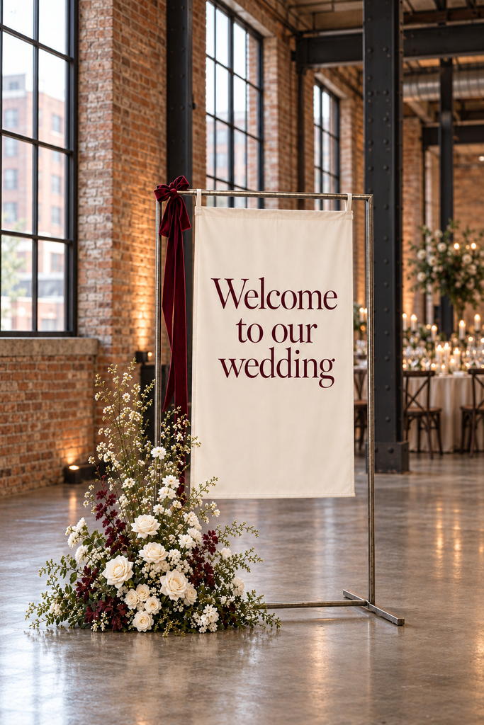
The useful takeaway is that your paper goods can have a consistent personality. A typeface, illustration, or small motif can carry from the invitation to the welcome sign and dinner menu.
For a Chicago wedding, I would consider an illustration of your venue, a subtle architectural detail, or a reference to a neighborhood that matters to you. A fabric welcome sign is another way to connect signage with a softer design scheme. These are ideas for making the broader personalization trend your own.
Keep the practical purpose in mind, too. Your seating chart needs to be readable. Your welcome sign needs a place where guests can pause without blocking the entrance. Beautiful design works best when it helps people feel at ease.
7. Food and drink that feel personal to the celebration
Inspire a cocktail-hour station, a favorite family dish, or a late-night snack with a connection to your story. For Chicago couples, there are plenty of ways to give out-of-town guests a taste of the city, but you don’t need a local theme if another choice feels more personal.
Before adding a station, talk with your caterer and planner about service. Where will people gather? How quickly can guests be served? When does it fit into the evening?
As your photographer, I want to know about these plans ahead of time. If there’s a meaningful food tradition or a surprise you’re excited to share, tell me so I can anticipate the moment and the reactions around it.
How to make 2027 wedding trends work at your Chicago venue
Start with the room you booked. Take a look at its walls, floors, furniture, windows, and lighting before committing to rentals. Your décor choices will feel more connected when they respond to what’s already there.
Then choose a few priorities. Perhaps you care most about the ceremony setting, an inviting dinner table, and a beautiful bar. Giving those areas attention can create a more cohesive experience than trying to include every idea in your saved folder.
Work through the plan with your planner, florist, and venue team. They can help you understand what fits the space and what it takes to install it.
Finally, make room in the timeline to photograph the finished reception before guests enter. Share the setup schedule with me and your planner so we can arrange that naturally around the rest of the day. Those wide room photographs and close details will help you remember how everything came together.
Questions about 2027 Chicago wedding trends
What wedding colors are trending for 2027?
Early forecasts include plum, merlot, moss green, and powder blue. Chicago vendor reporting also points toward soft neutral backgrounds with deeper accent colors. Use those directions as inspiration, then choose the shades that suit your venue and your taste.
Is wedding draping a good choice for a Chicago reception?
It can be, especially when you want to create a focal point or soften part of the room. Ask your venue and design team which installations are possible and request a complete quote before building the rest of the décor around it.
How do I include trends without making my wedding feel dated?
Choose details you would love even without a trend report. You might bring a current color into your napkins or stationery while keeping the larger design grounded in your venue and personal style.
Planning your 2027 Chicago wedding?
I’d love to hear what you’re imagining, from the atmosphere of your reception to the people you’re most excited to celebrate with. I photograph the details you’ve thoughtfully chosen alongside the moments that give them meaning, with natural direction when you need it and space to enjoy your day.
Tell me about your wedding and inquire about photography here.


We accept a limited number of celebrations each year to fully devote our artistry. If you feel the energy, reach out.

